

Dashboards and reports are essential components of data visualization and analytics in Power BI, although they have distinct functions. It is necessary to comprehend the main distinctions between the two to efficiently apply Power BI in your company.
This guide will cover the differences between Power BI dashboards and reports, highlight some of its unique capabilities, and offer real-world examples of when to utilize each. Understanding the differences might help you as a decision-maker, business analyst, or data scientist to better your reporting approach and data analysis workflow.
Table of Contents
- Understanding Power BI Dashboard
- Understanding Power BI Reports
- Key Differences Between Power BI Dashboard and Report
- Features of Power BI Reports
- Features of Power BI Dashboards
- Key Similarities Between Power BI Dashboard and Report
- Limitations with Power BI Dashboard
- Can a Power BI Report Become a Dashboard?
- Final Thoughts
- FAQs
Understanding Power BI Dashboard
A visual display providing a consolidated view of data in Power BI are dashboards. Using dashboards, businesses can monitor their key metrics, gain high-level insights, and track performances. Dashboards help display data in real-time and can be connected to various data sources, such as cloud services, databases, and streaming data.
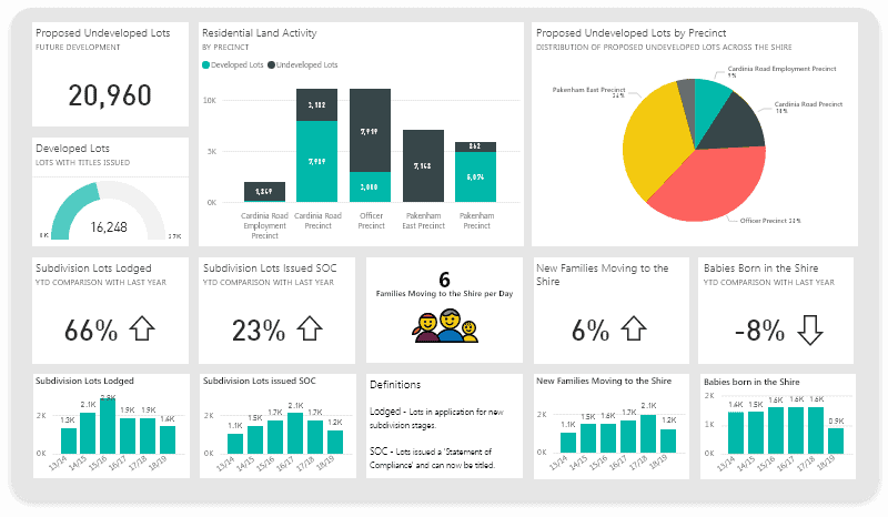
You can use different visualizations, including graphs, charts, cards, and gauges. They help represent key performance indicators and give an overview of business. They are also limited to a single page offering different aspects. The dashboard is the most straightforward information to help people understand the company better.
In simple words, dashboards keep everything simple to understand. When dashboards are published on Power BI, developers can also fix visual elements or filters for specific end users. Because of this, dashboards are used whenever a fast analysis is required on any kind of screen, including presentation screens, mobile devices, and computer monitors.
However, it is important to remember how the end user will use these dashboards while designing the visualizations.
Understanding Power BI Reports
When you want a detailed presentation of your data, you use the Power BI reports. The report usually contains complex information that may be challenging for users to understand. It is a multi-perspective data viewing for gaining better insights and understanding of data. Reports are intended to offer comprehensive data analysis, enabling users to delve into different facets of the data and derive valuable insights.
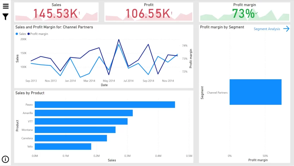
Besides, in reports, you get complete information about data, including columns and rows. These reports are perfect for people who want to have a detailed representation of data to make business decisions. In the desktop version of Power BI, you can create any number of pages with visualization.
In the desktop version, report viewing offers a similar design experience as the report editing view in the Power BI service. They vary in that Power BI Desktop allows you to query your data and interact with your model to ensure that your data provides the finest insights in your reports.
Key Differences Between Power BI Dashboard and Report
The table below depicts the critical differences between the Power BI dashboard and the report:
| Elements | Power BI Dashboard | Power BI Report |
|---|---|---|
| Overview | Single page with a consolidated view | Multi-page with detailed view |
| Definition | They are high-level business data views, and the navigation of reports originates from here. | These are created based on datasets, and each dataset can be viewed from a multi-perspective point of view. |
| Purpose | This is designed to offer a high-level overview of key insights and metrics. They are concise, easily digestible, and focused, allowing users to monitor crucial information in one go. | It is designed for in-depth reporting and analysis. Users can create interactive and detailed data visualizations, gain insights, and explore data. |
| Structure | They are composed of tiles, including individual reports, visuals, text, images, and web content. These tiles are arranged to create a visually informative and appealing layout. | These have multiple pages containing one or more visualization aspects. These are often designed to view a specific data aspect comprehensively. |
| Interactivity | Compared to reports, they offer limited interactivity. Although users can interact with titles to get more information on that particular dashboard, they are essentially for summarizing purposes. | It offers a high interactivity degree. Users may engage with visualizations by choosing data points, adding filters, examining more information, and cross-filtering graphics to analyze data from various angles. |
| Data exploration | They are not intended for in-depth analysis. Instead, they are launching pads to access the information available in related reports. | They offer in-depth analysis and a wide range of data visuals. Users can perform detailed analyses to investigate trends or answer questions. |
| Sharing | These can be shared with Power BI service and others. To interact with tiles, they can also be shared with specific users, groups, or individuals. However, users may not be able to perform any detailed analysis. | These can be shared using the Power BI service with others. People can collaborate, work together, or leave comments on reports. They can also be embedded in other websites or projects. |
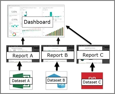
| Data model | They don’t have their data models. They are usually linked to one or more reports, and the data models of the reports are the source of the data shown in tiles. | Reports are usually linked to a particular data model, including relationships, tables, computed columns, and measurements. In Power BI Desktop, users may develop and edit the data model. |
| Benefits | Business owners can use these to make profit and loss decisions based on analyzing KPIs. | These are used for detailed analysis across facts and dimensions. |
| Real-time use case examples | They are used to analyze high-visibility data. For example, dashboards can help determine the total number of heart patients in a hospital and the tablets they consume daily. It will help medicine companies to produce that specific medicine. | These are used for detailed analysis. For example, medicine companies can use the thorough analysis of heart patients and their daily medicine count using Power BI reports. |
| Application | Modern businesses use these on mobile and internet devices. | It can be used everywhere, starting from services to sales. |
| Creation environment | It can be created in Power BI services and not on a desktop. | It can be created in Power BI services and desktops. |
| Creation environment | It can be created in Power BI services and not on a desktop. | It can be created in Power BI services and desktops. |
| Creation environment | It can be created in Power BI services and not on a desktop. | It can be created in Power BI services and desktops. |
| Creation environment | It can be created in Power BI services and not on a desktop. | It can be created in Power BI services and desktops. |
| Email Subscription | It is not available for the dashboard. | These can be subscribed to and delivered to users’ inboxes at any point. |
| Alert notification | They have an alert feature to raise an alarm for immediate attention. | Such a feature is not available in reports. |
| Raw data | Only the Power BI dashboard allows for the export of raw data. The visualization and presentation elements aren’t, though. | Raw data in reports can be exported to tabular or other forms. |
| Natural language queries | It is possible to query in the dashboard. | This feature is not present in reports. |
Features of Power BI Reports
Listed below are some key features of Power BI reports:
- It has excellent data transformation and modeling capability using Power BI desktop.
- Users can explore in-depth data using interactive visuals.
- Customized formatting to match the organization or brand’s style.
- Supports different visualizations, such as tables, charts, maps, and matrices.
- It can connect to different data sources, including on-premises and cloud-based data.
- Advanced analytics options include machine learning integration, predictive modeling, and NLP processing.
- Easy integrations with Microsoft tools, like PowerPoint and Excel.
- Collaboration and sharing abilities using Power BI service.
- Easy integration with third-party tools, like Azure and Salesforce.
Features of Power BI Dashboards
The critical characteristics of the Power BI dashboard are as follows:
- They contain data visualization elements, such as graphs, charts, tiles, gauges, and maps to display essential metrics.
- They aggregate data from multiple sources, such as reports, data sources, or datasets, providing high-level data summaries.
- Dashboards offer real-time or near real-time data, thus ensuring the latest information.
- Interactions are limited but can be done by clicking on visuals.
- They can be customized to match the organization or brand’s specifications.
- They can be published on Power BI services and shared with other people.
- It also offers security features enabling administrators to take control.
- Easy integration with other sources, including cloud services, databases, and Excel spreadsheets.
- It generates machine learning models, enables AI-based text analytics and picture identification, and interfaces with Azure Machine Learning.
Key Similarities Between Power BI Dashboard and Report
Understanding the Power BI dashboard and report differences is a good idea. However, it is also great to know the similarities that can help during different processes.
| Element | Similarities |
|---|---|
| Data visualization | They are used to visualize and present data in an understandable manner. It is done using charts, graphs, maps, and tables. |
| Data connection | Both can connect to multiple data sources, such as Excel files, databases, cloud services, etc. Users can also import, load, and transform data to create visualizations. |
| Interactivity | Interactivity is available in both features but is limited in dashboards. You can use filters and tiles for interactions. |
| Collaboration and sharing | Both can be shared internally and externally for easy collaboration. |
| Real-time data | Dashboard and report offer real-time data for live changes and monitoring of updates. |
Limitations with Power BI Dashboard
- You cannot interact with pinned images. When you click within one of these graphics, it functions as a hyperlink that brings you to the source report rather than performing standard interactions. This is because these visuals might be generated from numerous datasets.
- It cannot filter using slicers.
Can a Power BI Report Become a Dashboard?
You will need a Power BI architecture to convert a report into a dashboard. However, reports are the building blocks of any dashboard and are the source for its visuals. However, the high-level overview of a dashboard may be functionally mimicked by a single-page report created with a summary view but without the detailed interaction that reports are known for.
Although reports provide the comprehensive context for the brief highlights displayed in dashboards, they do not automatically become dashboards in the Power BI environment. A dashboard’s overview, however, may be mimicked by creating a one-page report with a strategic summary structure that balances interactivity’s complexity and brevity – a crucial tactic for some analytical circumstances.
Final Thoughts
The decision between a report and a Power BI dashboard ultimately comes down to your particular requirements and the environment in which you’re operating. Reports are better suited for in-depth research and multi-page narrative, whereas dashboards are best for real-time monitoring and rapid insights. By comprehending their distinct attributes and functionalities, you may use both instruments to construct an all-encompassing data plan that satisfies your organizational goals.
This guide has clarified the distinctions between Power BI reports and dashboards. Anyone interested in a data scientist or engineer job should check out Power BI. If you want to excel in one of these fields, you can enroll in the Data Science & Engineering bootcamp by CCSLA. You can become an expert in the field in just 12 weeks.