
Creating a dashboard in Power BI can be very helpful for businesses. It maximizes the value of your data and allows you to present them in a more engaging and well-structured form. Power BI dashboard helps you convert your raw data into meaningful data that you can use to make essential business decisions.
Whether you are a data analyst or business professional, you will find the Power BI dashboard helpful when you need to implement data visualization effectively. To help you guide through Power BI dashboard creation, we are here with its step-by-step illustration.
What is Power BI?
Power BI is a business intelligence tool of Microsoft that is mainly designed to curate and present data insights that are most intriguing and engaging. It is a versatile tool that can easily derive data origins, including cloud services and Excel spreadsheets.
Power BI is used by many businesses to create better visualization of data through charts, graphs, and other data interpretation techniques. Discover the art of Power BI more through the CCSLA exclusive PL-300: Microsoft Power BI Data Analyst course to gain valuable insights from industry leaders.
Furthermore, Power BI offers data refinement and structuring to enable the development of reports, presentations, and interactive dashboards. The Power BI works at its total capacity to convert data, clean it, and make it more appealing using visual elements. It facilitates sharing and collaboration using cloud services. It helps them to cooperate reasonably in the team and make data-driven decisions.
Features of Power BI
Following are some features of Power BI that you should know before moving on to how to create a Power BI dashboard:
- Power BI offers the fastest performance and better accuracy when there is a small volume of data.
- It has a user-friendly interface that can be easily accessible on any device.
- It is based on Microsoft Office 365 and is easy to understand.
- Power BI allows you to work with several data sources like text, SQL Server, IBM DB2, MySQL, Excel, etc.
- Power BI allows you to connect with the R programming language that supports various data analysis expression (DAX) measures and functions.
- The tool offers functional integration with the Microsoft Azure cloud platform.
- It helps you to analyze big data and interpret them to analyze and find patterns.
What is a Power BI Dashboard?
A power BI dashboard acts as a digital control center where vital information is stored. A visual approach enables data analysts to comprehend and view data. It makes it simple for them to follow the data insights and make developments in business operations. Understanding the fundamentals of Microsoft Power becomes essential in this case. Before learning to handle the Power BI dashboard, you can check the CCSLA’s PL-900T00: Microsoft Power Platform Fundamentals course.

The following are some advantages of using the Power BI dashboard:
- A Power BI dashboard enables users to analyze big data and metrics.
- It is used by businesses to prepare reports and view all embedded metrics to have a glance.
- You can easily customize the dashboard on Power BI to meet your business needs.
- Power BI dashboard can also be implemented into applications to offer a unified experience to users.
- You can instantly share a dashboard with any of your colleagues within the organization.
- The Power BI dashboard allows you to visualize data and get real-time insights.
- It enables data consolidation features to increase performance and interactivity.
- It is cost-efficient and comes in a free version.
How to Create a Power BI Dashboard: Step-By-Step Tutorial
To effectively understand how to create a Power BI dashboard, follow the below step-by-step tutorial:

Step 1: Import the Data You Want to Represent Visually
- First, log into your Power BI service account on your device.
- Now, an interface will open on your screen.
- On the Home screen’s lower left side, click the Get Data button.
- Multiple options will appear, such as Discover content and Create new content. In the Create New Content section, select Get on Files.
- Go to the Local File, and choose a file you want to represent visually. It can be in any format, say Excel file or any other file.
- You can either import or upload that file to Power BI. Choose to import or upload it to get started.
- Once the process is complete, your data set will appear in the recent section on the Home section under the My Workspace screen.
Step 2: Choose the Data Sources
- You can connect to data from multiple sources, such as the Azure database or Synapse Analytics. Furthermore, you can opt for DP-900T00: Microsoft Azure Data Fundamentals to better understand Azure concepts and techniques.
- Go to the Home section and click Get data under the “Create new content” database option.
- A typical list of data types will appear; click on the relevant database or data source.
Step 3: Create a Data Model
- To create a data model for your business, click “Create” in the Home section.
- Two options will appear: paste or manually enter and pick a published dataset. Choose the one option that suits your preference.
- Once the data model is created, you are set to visualize and establish relationships between charts and tables.
Step 4: Build a Relationship Between Tables
While learning how to create a Power BI dashboard, you should know how to build relationships between tables manually as well as through its autodetect features. If Power BI is unable to determine the proper relationship between two tables, it will not be able to create relationships automatically. So, knowing manual techniques also becomes essential.
Autodetect
- Navigate to the Modelling tab.
- Select Manage relationships.
- Now, click on the Auto Detect option.
- Close the dialog box now.
Manually
- Navigate to the Modelling tab.
- Select Manage relationships.
- Now, click on the Auto Detect option.
- Click on New; a Create relationship dialog box will open.
- Select the tables in the first table drop-down list and the column.
- Select the other table you want to establish a relationship within the second table drop-down list.
- Now, select the requisite column, and once done, click OK.
Step 5: Data Visualization
After importing and establishing relationships, you can start visualizing. Select a wide array of tools in Power BI to create a perfect report.
To get started with visualization, follow these steps:
- Go to My Workspace and click on Edit.
- Under Visualizations, you will see several charts, tables, and maps.
- You can use any of those tables, charts, maps, and other complex models like waterfalls, maps, gauges, funnels, etc.
- Drag and drop the visuals from the right sidebar to the axis.
- You can easily add multiple fields to each axis.
- Once you prepare a report, you can save it.
- To save, go to File> Save or Save as> Enter a name for the report, and then Apply.
Step 6: Design a Perfect Dashboard
Designing a perfect dashboard requires a skilled professional who knows how to handle Canvas. The dashboard is the only angle page that needs to be constructed so that all significant highlights of the story are adjusted there. So, the key thing to understand here is to play with better colors and fonts. Adding images, media, and other metrics makes visualization more engaging.
To add a dashboard theme:
- Go to the dashboard and click Edit.
- Click on the Dashboard theme. A dashboard pane will appear. Select the one pre-built theme like light, dark, or any custom-built theme.
- To create a custom-built theme, select Custom in the drop-down.
- You can add a background image from your storage to the theme by uploading a JSON file or simply copying and pasting the URL of the image.
To add images, texts, and videos:
- Click on the +Add a tile option.
- Now, add the media, whether image, text, video, or any web content.
- You can also add slicers, filers, drill-through options, etc., to engage stakeholders and attract their interest.
Step 7: Share and Collaborate
Now that you know how to create a Power BI dashboard, create your beautiful creative pieces and share them with clients and stakeholders to collaborate with them. Share it with your teammates to get them familiar with the elements. You can publish the dashboard in Power BI by simply clicking the Publish button. It will easily be uploaded to the Power BI service. Furthermore, you can share a direct link to the dashboard or embed the link on a website or other applications.
What Should You Consider Before You Create a Power BI Dashboard?
Before you create a Power BI dashboard, make sure to understand the need for it. It would help if you considered certain factors that are crucial questions that every business should satisfy before implementing the dashboard. Following are those questions that you should be aware of:
- Who are the end users of the dashboard? For different audiences, expectations from the dashboard will be different. Get an overview of all the end users’ key metrics and then create a dashboard with a common goal that satisfies the business objective. Furthermore, you can opt for multiple dashboards to serve different audiences.
- What is the primary need for the dashboard? Understanding the needs and goals of the dashboard is highly significant. It would help if you analyzed the trends and patterns of its needs before installing it in your business.
- Who should handle design and implementation? Does your team have experience with the Power BI dashboard? You can give them some training before implementing it entirely. Furthermore, assign design and update tasks to some specialists to create better interfaces and handle any problems.
Power BI Dashboard Use Cases
Many organizations use Power BI dashboards to visualize their crucial data. Many organizations have implemented this Power BI dashboard in many cases, such as:
1. Customer Profitability Dashboard
Businesses use a dashboard to analyze customers’ profitability ratios. The CFO’s key metrics help business executives analyze the charts and tables more appropriately and then make decisions based on the details. The dashboard displays all the product details, gross margins, and total revenues.
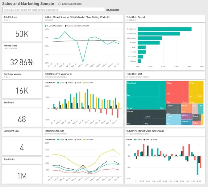
2. Sales and Marketing Dashboard
The Power BI dashboard is more frequently used for sales and marketing purposes, helping businesses comprehend their market shares, product sales volume, and product pricing techniques.
3. Human Resources Dashboard
Businesses use this to get information and keep a record of new hires, resigned employees, and active employees. This helps them understand who should be hired and what hiring strategy they should follow. It makes HR tasks more accessible by allowing them a central database and platform to track employees. This way, they can focus on other business operations to increase overall efficiency.
4. Inventory Analysis Dashboard
The Power BI dashboard is highly efficient for inventory purposes. It helps the business track the inventory orders and stocks. This ensures that the manufacturing of the product line does not face any issues in working. This way, business work is smooth in between, and the company can focus on its marketing and pricing strategies to increase profitability.
Conclusion
Power BI comes with the best features and benefits for businesses. The dashboard on Power BI is easy to create but requires certain guidance. Power BI dashboard is majorly used for customer analysis, HR analytics, and sales scorecards.
Social media monitoring, financial reporting, team performance analysis, and inventory management are some of its other common use cases in businesses. With this, we understand that most successful businesses use the Power BI dashboard to optimize their business operations.
Businesses often look for professionals who have experience in data analysis and Power BI tools. They are looking for those who know how to create a Power BI dashboard and have clear fundamentals.
If you are looking for the opportunity to learn and experience hands-on projects on data analysis and analytical engineering, you can get the CCSLA Data Analytics & Engineering Bootcamp. You will get assistance from certified trainers, live instructors, and one-to-one mentorship to guide you through the data analyst journey.


