
In today’s data-driven environment, effective information visualization is essential, and Tableau is a critical tool that enables users to accomplish just that. Regardless of your degree of experience as an analyst, this article will guide you through designing and producing a dashboard that looks great and extracts meaningful information from your data.
Table of Contents
- What is Tableau?
- What is Tableau Public?
- What is a Dashboard?
- How to Create a Dashboard in Tableau?
- 6. Adding Sheets
- How Do You Use Multiple Views to Filter Other Views in the Dashboard?
- Different Dashboard Size Options in Tableau
- Benefits of Creating a Dashboard
- Different Types of Dashboards in Tableau
- Final Thoughts
- FAQs
What is Tableau?
Tableau is one of the best tools for data visualization and analysis in business intelligence. The platform was rated as a leader in business intelligence and analytics by Gartner Magic Quadrant. In June 2019, Salesforce acquired Tableau, which was launched in the United States in 2003. Using this platform, you may make dashboards, graphs, tales, maps, and data analyses to aid decision-making.
With Tableau, people can easily understand their data. You may establish a direct connection to your database or connect to your data via Excel, CSV, or another format. Tableau allows you to create interactive dashboards.
What is Tableau Public?
Tableau Public is the leading software for creating analytics and business visualizations. Although it is limited to saving all works in Tableau Public, the free edition still has nearly all of its capabilities, making it ideal for educational purposes or use by students.
What is a Dashboard?
A dashboard is a place where different visuals can be displayed together. It is a platform to convey different but related information in an easy-to-understand manner. It generally includes KPIs and other essential business metrics important to stakeholders. These dashboards are helpful across industries since they are highly customizable.
They could tell you about things like what happened, why it happened, possible consequences, and what you should do. Furthermore, even people who are not as familiar with the data may rapidly understand the insights or story the data gives since dashboards incorporate visual aids like tables, graphs, and charts.
How to Create a Dashboard in Tableau?
Dashboards may be established by combining one or more of your generated sheets. You can even add interactivity and do much more. This applies to Tableau Desktop, Tableau Cloud, and Tableau Server.
Let’s look at how to create a dashboard in Tableau:
1. Tableau Software
The first step is to download Tableau software from the Tableau website. You can select the compatibility with your Windows or Mac operating system. Install the application by following the process. Launch the application, and you will be ready to create dashboards.
2. Data Source Connection
Next, you must connect it to your data source. Launch Tableau and click on the Connect to Data option, and you will choose the data source. It supports data sources like CSV and Excel, relational databases like SQL and Oracle, and cloud systems. After the data source is connected, you can create the worksheet.
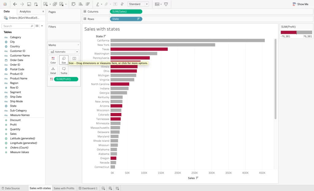
3. Creating Worksheet
It is easy to create a worksheet on Tableau. You must open the software and select a new worksheet from the toolbar. Click on the Rename option to rename your worksheet. Next, select the data source for the worksheet and choose which data fields to include. You can drag the fields from the data source onto the canvas.
Once the data fields are chosen, you can start creating your worksheet. Once done, click on OK, and changes will be applied. You can find your worksheet in Tableau.
4. Creating Dashboard
You will see a menu bar with a dashboard button on the top of your screen. Click on the same. It will open a drop-down column where you can select a new dashboard. You can even rename it if needed.
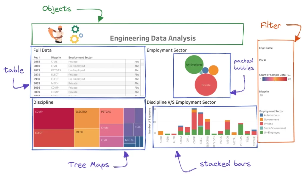
The dashboard will be a black workspace with a panel on the left. It has three sections:
- Size aids in determining the dashboard’s proportions and guarantees desktop and mobile device responsiveness.
- You may add or delete different visualization sheets from the dashboard using sheets.
- Adding text, photos, webpages, and extensions to the dashboard is made possible using objects.
However, the side panel’s Layout tab contributes to the dashboard’s design by adding extra aesthetics. You may change the background pictures, padding, and border lines.
5. Configuring Size
Click on the Dashboard button on the side panel. In the Size section, choose the drop-down option to select your preferred dimensions. You can choose a preset sizing option or customize the size.
6. Adding Sheets
After setting the size, it is time to add sheets. Drag each worksheet and drop it on the canvas. Your dashboard will show the visualization of data available in the sheet. Remember to organize the sheets as per the available size.
Select the Floating option from the drop-down menu on your screen’s right side after clicking on any graph or graphic. This allows you to rearrange and arrange every image on the canvas. You can also shrink or enlarge the size of any visualization on your dashboard. Click on the image, click and hold image vertices, and resize them.
7. Adding Filters
An interactive dashboard allows readers more flexibility in viewing the data and exploring its story.
You can achieve interactivity using filters. To add filters, follow the below steps:
- Click on the sheet in which you need to add filters.
- Click the Filter option after selecting the little down arrow next to the image.
- Add the filter you want.
You can view things like demography, time range, region, and much more through filters.
8. Adding Objects
From the Objects area of the side panel, you can add different buttons to the dashboard and customize what happens when you click on them. For instance, the project title, business logo, or screenshots from a website might be included.
9. Change into Presentation Mode
When you switch to presentation mode, you can interact with data visualization like your readers will do. In this mode, you can focus on the dashboard and hide the building tools. It is an excellent way of assessing your presentation layout, data story, and filters and ensuring everything is suitable for publishing. You can go to presentation mode by clicking the presentation button on the top-right side.
10. Sharing Dashboard
You can share dashboards as workbooks with other users. You must click on the share option in red color and enter the server address of the Tableau server. However, you can only do it if you have a Tableau server account or a Tableau online account. Else, audiences can also view your dashboard.
How Do You Use Multiple Views to Filter Other Views in the Dashboard?
You can use a single view to filter other views, but you can also use multiple views to filter other views. However, the trick is to use at least three views and remove their self-filtering abilities.
Follow the below steps:
- Open a dashboard with three views.
- Select the first view to be used as a filter. From its shortcut menu, select – Use as a Filter.
- Click on the menu again and select Ignore actions.
- Repeat the above steps to use any other view as a filter.
Different Dashboard Size Options in Tableau
Let’s look at the different size options you can find in the Tableau dashboard:
1. Default (Fixed Size)
In this, the dashboard remains the same size, irrespective of the window on which it is displayed. If the size is larger than the window, it becomes scrollable. You can either choose a preset or customize the size. These kinds of dashboards allow you to precisely define where information appears on the dashboard, which is helpful when it comes to floating elements.
The published dashboards built on default size load faster since they are likely to use a previous cache version.
2. Range
You can specify minimum and maximum ranges in this. Scroll bars appear if the dashboard window’s size is less than the required minimum. White space is shown if it exceeds the maximum length. It is good when you need to design two different display sizes with the same content or similar shapes. It is also suitable for mobile and vertical layouts.
3. Automatic
Here, the dashboard will automatically resize as per the window. This setting should be used when you want Tableau to handle the sizing. Using a tiled layout will give you the best results. If you are still determining where the dashboard will be used, utilize the automatic scaling setting cautiously since it may provide unexpected results on different screens.
Benefits of Creating a Dashboard
There are many benefits of creating and using a dashboard:
1. Usability
Companies create gigabytes of raw data daily. Using this data for valuable insights can help them make informed business decisions. With the help of a dashboard, companies can see all metrics on one screen and gain valuable insights.
2. Access to Data
In one dashboard, you can access everything to understand a company’s complete workings.
3. Decision Making
The essential decision-makers can use this dashboard to forecast sales, view anomalies, and review historical data for business strategies. The information is in interactive form and can be further filtered out.
4. Accountability
It gives an unbiased approach to how the company is performing. It can show your growth percentage and let you know if you failed in any particular campaign. Accountability helps in keeping companies away from bankruptcy.
5. Interactivity
Dashboard offers a dynamic experience that makes it simple for organizations to use and understand. You may search for phrases, apply a filter, isolate a specific statistic, enlarge a map or time series line plot, or even leverage tools from outside sources to create anomalous alerts.
6. Analysis
These dashboards can be used for detailed analytical reports. While you are monitoring important persistence indicators and interpreting historical occurrences, the dashboard makes data analysis chores easier.
Different Types of Dashboards in Tableau
Tableau provides an option to create different kinds of dashboards.
Some of them are:
- KPI dashboard
- Top-down dashboard
- Q and A dashboard
- Bottom-up dashboard
- One big chart dashboard
Final Thoughts
Following this detailed tutorial, you can acquire valuable abilities that will help you view data and extract insightful knowledge properly. Remember that this is just the beginning of the journey; keep learning about Tableau’s capabilities, experimenting with various visualizations, and honing your dashboard designs.
Tableau has countless uses, including personal inquiry, academic research, and professional endeavors. To learn more about Tableau and how to work on it, you can check out CCSLA’s website. They have many educational articles to help you understand more about this software. You can also enroll in one of their courses, such as the data science and engineering bootcamp, to enhance your technical knowledge to work on this platform.